Standing out from day one in a competitive market
THE BRIEF
Bigger Picture knew they needed an identity that would stand out in a competitive field. They wanted a brand that was both creative and professional, with strong recall to build awareness quickly. Their goal was a full brand identity with clear guidelines, giving them the flexibility to scale as their business grew.
The creative journey
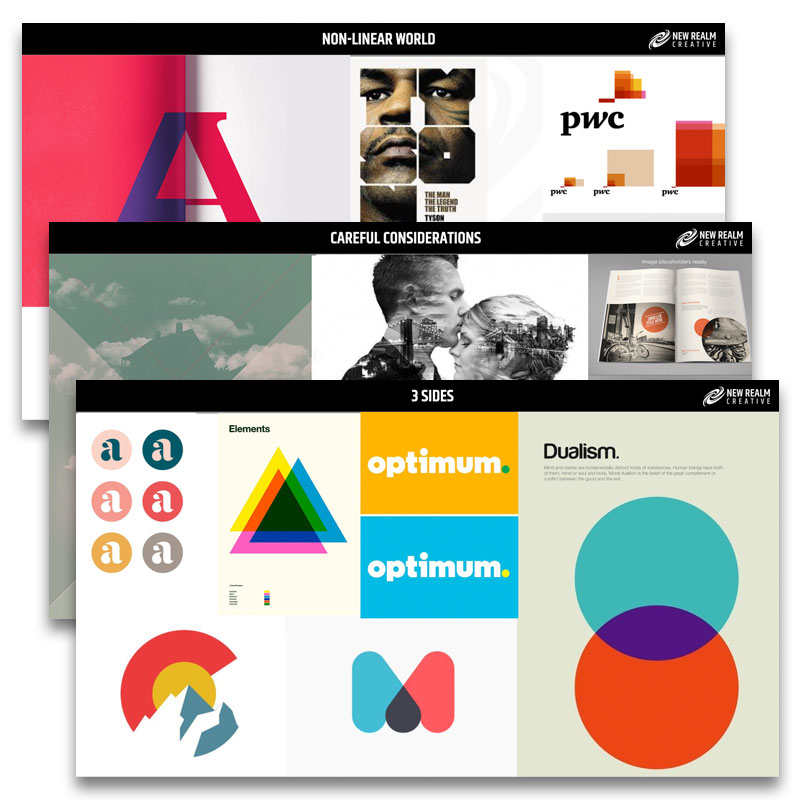
To kick things off, we got to the core of Bigger Picture’s values and mapped out the competition. From there, we created several Stylescapes to give Helen and Andrew a visual snapshot of different creative directions. This collaborative approach helped refine the look and feel of their brand.

Logo development
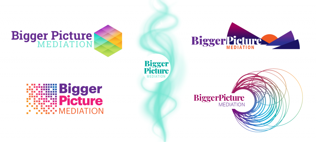
Next, we presented the team with a range of logo options. Versatility was key— Bigger Picture needed a logo that would look sharp across platforms and adapt as their brand expanded. Future-proofing was essential, as not all brand channels would be live in the first year.
FINAL DESIGN
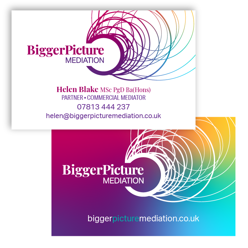
The team chose a distinctive logo featuring intertwining circles—a design that symbolically captures the complex nature of disputes and the clarity Bigger Picture brings to resolution. We approached the logo as a “contextual design,” understanding that modern brands need to adapt fluidly across various digital and physical spaces, from smartphones to office signage.
Developing the Brand
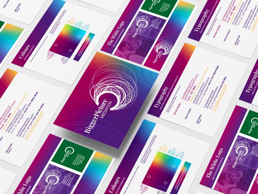
We built a complete brand identity system, equipping Bigger Picture with everything they’d need to roll out their new look consistently. The guidelines covered all essentials: adaptable logo versions, color palette, fonts, and usage guidelines to ensure their brand would make an impact wherever it appeared.
Implementation
With guidelines in place, the Bigger Picture team was ready to implement their new brand across all touchpoints. From PowerPoint templates to business cards, letterheads, and a website that aligned perfectly with the brand, every detail supported a seamless launch.

Client Feedback
After a strong recommendation and interviewing a few companies, we chose New Realm Creative for our branding. They weren’t the cheapest, but after talking with Matt, we felt confident he understood exactly what we needed. New Realm provided six logo choices, all of which were strong, making it hard to choose! For us, this was about more than a logo; it was about creating a brand and colour scheme that would help us stand out in the legal industry. Our web designer was thrilled with the brand pack New Realm provided, which made building the site in line with our brand effortless.
Helen Stoddart, Director, Bigger Picture Mediation
We’re impressed with New Realm’s professionalism and support, helping us launch with everything from presentations to card templates. Highly recommend them to anyone looking to launch or rebrand!

